Mobile-first: why 70% of your patients find you on their phone
If your website wasn't built mobile-first, you're losing patients before they read the first line.
Quick answer
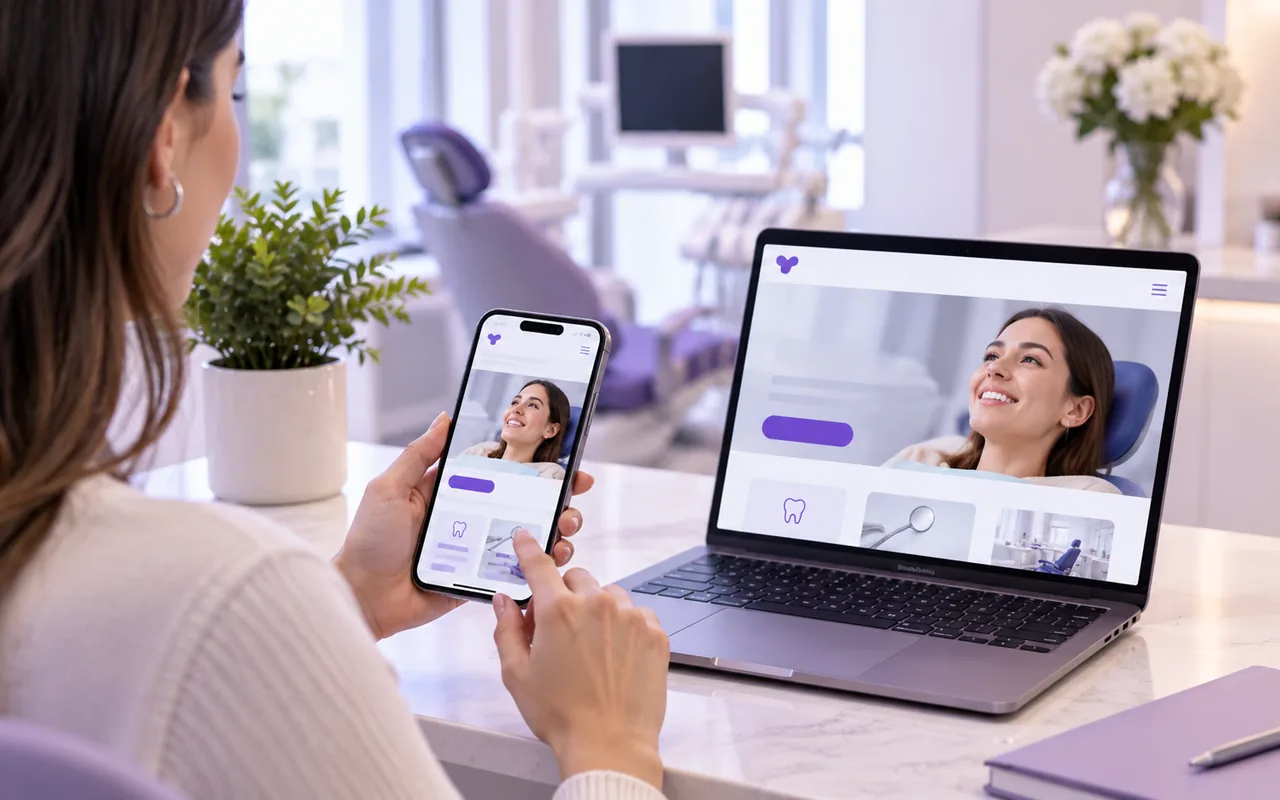
Designing mobile-first means starting from the smallest screen, not adapting it afterward. In practice: large thumb-friendly buttons, text you can read without zooming, and the three actions patients look for most — call, book, message — one tap away on every page.
Key takeaways
- Most visits to a clinic's website come from a phone, not a desktop computer.
- A button that's hard to tap costs you patients just as much as a slow site does.
- Calling, booking, and messaging on WhatsApp should be one tap away from any page, not buried on a contact page.
- Mobile-first isn't 'looks fine on a phone' — it's designing for that screen first, not adjusting it at the end.
In this article
Your typical patient isn’t at a desktop
Most searches for “clinic near me” or “dentist in [your city]” happen on a phone, usually in the middle of something else: in another doctor’s waiting room, walking somewhere, or right after a friend recommends your clinic over text. It’s rarely someone sitting at a big screen calmly comparing options.
If your site was designed for desktop first and shrunk down afterward to fit a phone, that shows: text that forces you to zoom, buttons crammed together, menus that cover half the screen. Every one of those details is one more reason to close the tab and check the next clinic on the list.
The 4 fixes that define a mobile-first site
- Big buttons, built for a thumb. No tiny text links squeezed between paragraphs — the actions that matter need their own button, with plenty of room around it.
- Text you can read without zooming. If a patient has to pinch-zoom to read a paragraph, the font size was wrong from the design stage, not a minor detail.
- Simple menus, not buried in layers. A hamburger menu with nested submenus takes several taps to reach “Services” or “Contact” — every extra tap is a chance for someone to give up.
- Short forms. Filling out a long form with a touch keyboard is slower and more frustrating on a phone than on a computer — every extra field lowers the odds it gets finished.
The call button is your most important conversion
On a desktop, “calling” means jotting down the number and dialing it separately. On a phone, a well-placed “Call now” button turns intent into action in a single tap, with nothing to copy.
That one detail — a phone number that’s a real tappable button, not just text — is one of the simplest differences between a site built for mobile and one that just “looks fine” on mobile. The same goes for the booking button and the WhatsApp button: they need to be available on any page, not buried under “Contact.”
Fast on mobile, not just on desktop
A mobile connection is rarely as stable as office wifi, so a site that loads fast on a computer can feel slow on a patient’s phone network.[1] Heavy images, slow-loading fonts, and unnecessary scripts all hurt far more in that context.
Designing mobile-first ends up being, in practice, the most direct way to improve the entire site’s experience: whatever works well on the smallest screen and the shakiest connection works even better everywhere else.
How Floix Web handles mobile
Every plan includes a site designed for phones first and optimized to load fast, with technical SEO built in. Forms ask only for contact details, with a notice not to include medical information, and messages arrive in your clinic’s inbox.
If you want to know how your current site looks on a patient’s phone, book a free call or check the plans.
Frequently asked questions
01How do I know if my current site is mobile-first or just "responsive"?
Open your site on your phone and time how long it takes to call the clinic from the homepage. If it takes more than one tap, or you have to hunt for the number in the text, it wasn't designed mobile-first.
02Does mobile-first design affect SEO?
Yes — Google indexes and ranks a site primarily based on its mobile version, so a poor phone experience directly hurts your search ranking.
03Is a desktop version still worth having if most visitors come from mobile?
Yes, but as the second priority: design for the phone first, then scale up — not the other way around.
04How big should tap targets be?
As a baseline, at least 44x44 pixels with room around them — enough to tap with a thumb without accidentally hitting the button next to it.
References